A professional interior does more than display a logo: it helps visitors know where to go, what to trust, what to understand and what to do next. By the end, you will be able to plan indoor branding around visitor movement, choose suitable formats and specify surfaces, lighting, placement and accessibility details with fewer costly revisions.
Key takeaways
- Decide whether each element informs, decorates, directs or supports a sale.
- Match messages to visitor intent in reception, corridors, meeting rooms and work areas.
- Map visitor movement before selecting signs, wall graphics or display formats.
- Use contrast, clear spacing and serviceable materials to protect usability and brand consistency.
Define the Job: Branding, Decoration, Signage or Sales Support?
Indoor branding is the planned use of a company’s identity inside a building to shape recognition, confidence and visitor behaviour—not simply to make walls attractive. It connects the brand with the physical environment, so the space feels deliberate and consistent rather than decorated room by room.
| Purpose | What it does | What it does not do |
|---|---|---|
| Interior decoration | Improves atmosphere through finishes, furniture, artwork or colour | It can work without identifying the organisation or guiding visitors |
| Point-of-sale advertising | Promotes a product, offer or action near a buying decision | Its message changes with stock, price or campaign |
| Wayfinding signage | Helps people choose a route and confirm a destination | It should not carry every brand message on one panel |
| Ordinary office signage | Identifies rooms, departments, hazards or rules | It solves a functional information need without expressing the wider brand |
A practical indoor branding definition includes both visual identity and a planned visitor experience. A reception feature can build trust, while a branded meeting-room entrance can reinforce recognition; neither should replace clear directions.
Separate identification, directional, regulatory and informational messages. Combining them into one oversized branded panel creates visual density and makes room or department changes expensive. Branding should support the environment’s purpose, not compete with it: visitors should recognise the organisation, understand where they are and know what to do next.
Match Each Room and Message to Visitor Intent
Place the message where the visitor needs it, not where an empty wall happens to be. Reception desk branding should welcome people and confirm that they have reached the right organisation; directional signs should appear before a choice, not only beside the destination.
- Lift branding can reinforce the brand during a short pause, display a concise service promise, or direct visitors to floors and departments. Keep essential floor information separate from decorative graphics.
- Corridor graphics should help visitors maintain orientation while moving between decisions. Use consistent arrows, department names and landmarks rather than covering every wall with unrelated imagery.
- Meeting room signage should identify the room, show its purpose or occupant, and support privacy or booking information. Where ADA requirements apply, permanent room signs need compliant raised characters, placement and Grade 2 Braille; attractive printed graphics do not replace those elements.
- Waiting-area branding should reduce uncertainty with queue instructions, service steps, estimated stages or useful product education. A visitor waiting for assistance needs clarity before persuasion.
- Retail counters and consultation points should support conversion by highlighting a small number of benefits, proof points or next actions. Put the strongest message within the visitor’s natural viewing angle.
- Staircase and washroom approaches need identification and safe movement cues first; use brand colour as reinforcement, not as a substitute for clear signs.
Separate identification, directional, regulatory and informational messages. Combining them in one oversized branded panel creates visual density and makes future room or department changes costly.
Plan Movement First, Then Choose the Right Format
Begin with a visitor journey audit, not a catalogue of materials. Walk from entrance to reception, queue, lift, destination and exit; mark hesitation, backtracking, congestion, blocked sightlines and places where visitors wait. Record viewing distance, dwell time, wall condition and available power at each point.
- Photograph each decision point from a visitor’s eye level.
- Note whether the message must welcome, direct, explain, reassure or convert.
- Test a printed graphic on the actual wall; texture, moisture, old paint and contamination can defeat adhesion.
- Reserve illuminated formats for locations with reliable power and check even light, not just LED wattage.
Choose the format that matches the visitor’s task and the time available to read:
| Option | Best use | Choose it when |
|---|---|---|
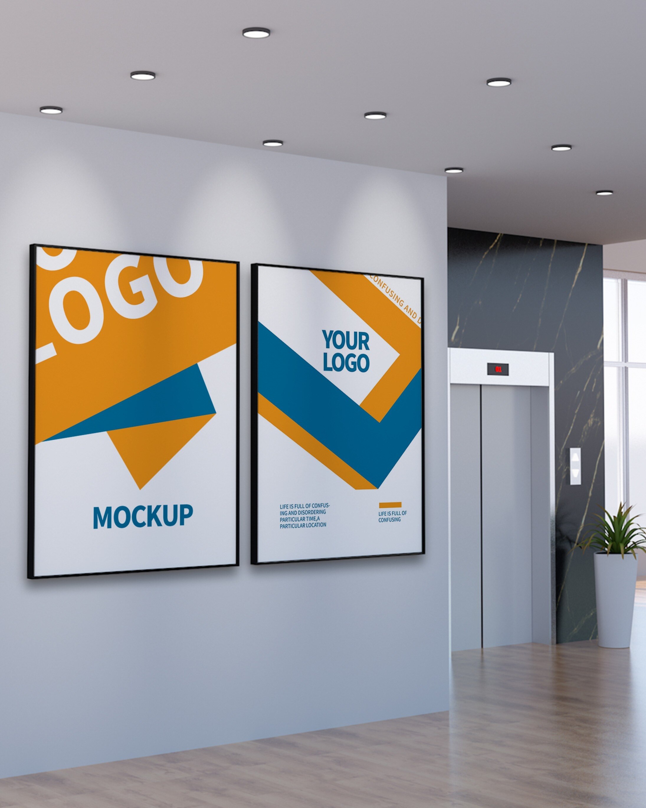
| Wall graphics | Brand story or large visual | Visitors pause and the wall is suitable for tested adhesion |
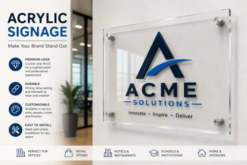
| Acrylic letters | Short names or values | You need depth, clean edges and strong visibility at close range |
| Reception logos | Immediate identification | The entrance needs one prominent brand marker |
| Directory boards | Multi-tenant navigation | Visitors must find several rooms, floors or departments |
| Printed panels | Product or process information | A fixed message needs structured detail |
| Window films | Privacy, zoning or glass branding | Glass needs pattern, branding or controlled visibility |
| Display boards | Changeable notices or samples | Staff must update content without remaking the installation |
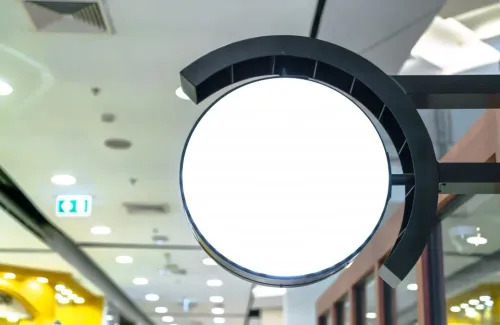
| Digital screens | Time-sensitive content or motion | Messages change frequently and power, maintenance and viewing angles are manageable |
Use directory boards at decisions, not where visitors have already passed them. A screen in a low-dwell corridor becomes decoration; a simple sign there works harder.
Translate the Brand Without Creating Visual Noise
Use one visual hierarchy: a visitor should notice the welcome message, understand the next action, then discover supporting detail. Limit each surface to one dominant message, one supporting graphic and enough unprinted area to let both breathe.
1. Approve brand colour matching with physical samples, not a PDF alone. Compare painted metal, vinyl, acrylic and fabric under the actual room lighting; substrate whiteness, gloss, translucency and LED colour temperature can shift the result.
2. Protect the logo with consistent logo clear space. Keep surrounding text, photographs, fittings and panel edges outside that boundary, and avoid placing the mark across joints, corners or busy imagery.
3. Set typography by viewing distance. Use fewer typefaces, strong weight contrast and generous line spacing; test the smallest text from the point where visitors will read it. A 4.5:1 contrast ratio for normal text and 3:1 for large text is a useful WCAG reference, not a complete physical-sign specification.
4. Choose imagery with one crop style and one visual subject per panel. Use matte finishes in glare-prone corridors and reserve gloss or metallic accents for small areas, where reflections will not interrupt reading.
5. Specify illuminated indoor signs for even light, not LED wattage alone. Check LED spacing, diffuser thickness, cavity depth and face transmission for hot spots and dark bands. Request TM-30 colour quality, including Rf and Rg, when the sign must match printed assets or merchandise.
Approve a full-size sample before production and inspect it from the visitor’s approach, not only from the installer’s position.
Specify an Inclusive, Durable and Serviceable Installation
Make accessible indoor branding part of the specification from the start: mount messages where a seated visitor can see them, keep circulation clear, and round or recess projecting edges. Fix each element to a wall substrate that can carry its weight; do not rely on a decorative finish or weak adhesive alone.
Ask for these installation details in the work order:
- Use a contrast ratio of at least 4.5:1 for normal-size text and 3:1 for large text as a legibility reference. WCAG 2.2 applies to digital content, not as a complete Indian signage code.
- Add tactile characters and Grade 2 Braille to permanent room or space signs where accessibility rules apply. Raised characters generally need at least 1/32 inch relief, correct character heights, and compliant placement; visual clarity does not replace tactile information.
- Specify non-glare finishes and view physical colour samples under the installed lighting. Acrylic, vinyl, fabric and paint change appearance with gloss, translucency, substrate whiteness and LED colour temperature.
- Require access panels, replaceable drivers and a documented cable route so repairs do not damage the wall or branding.
- Request the tested thickness, mounting condition and full assembly when citing ASTM E84; the test reports flame-spread and smoke-developed indices, not a complete fire rating.
For illuminated work, include dimming, day and night settings, and a driver checked for visible temporal light modulation. TM-30 data, including Rf and Rg, gives a stronger colour-quality basis than CRI alone. Pantone Media Solutions LLP can help document these physical samples and service access before fabrication.
Frequently asked questions
How do you decide whether indoor branding is needed for decoration or business support?
Define the job of each element first: use branding for recognition, decoration for atmosphere, signage for navigation and sales support for decision-making.
How should indoor branding differ between rooms?
Match each room’s message to visitor intent. Reception should establish confidence, corridors can orient visitors, meeting rooms can reinforce expertise, and customer-facing areas can support decisions.
Why should visitor movement be planned before choosing indoor branding formats?
A movement plan shows where visitors pause, turn and need information, helping you place directional signs and messages where people can act on them.
How can indoor branding remain professional without creating visual noise?
Limit competing messages, apply consistent colours and typography, preserve clear space, and specify durable installations that remain easy to clean, repair and update.